

Heart Attack Warning Signs Campaign
Heart Attack Warning Signs Campaign
✳︎
Heart Attack Warning Signs Campaign
✳︎
Heart Attack Warning Signs Campaign ✳︎ Heart Attack Warning Signs Campaign ✳︎

A public health campaign designed to help people recognize early warning signs of a heart attack and respond with confidence.
campaign Overview
The Heart Attack Symptoms campaign is a research driven public health initiative created to increase awareness of early warning signs in both men and women. It is informed by evidence from the American Heart Association, the Illinois Department of Public Health, and Mayo Clinic, which all emphasize that heart attack symptoms are often overlooked, misinterpreted, or dismissed until the situation becomes critical. The campaign focuses on presenting clear, accessible, and clinically accurate information that helps people recognize symptoms early and respond quickly. Through a unified visual system, symptom iconography, and a motion based educational introduction, the campaign delivers life saving information in a format that is easy to understand, medically trustworthy, and adaptable across digital, print, social, and motion platforms.
Problem Statement
Heart attack symptoms are often subtle, inconsistent, and easily mistaken for less serious conditions, which leads many people to delay seeking emergency care. The Illinois Department of Public Health reports that heart attacks remain a leading cause of death in the United States and that early recognition of symptoms is one of the most effective ways to reduce severe outcomes. Many individuals do not realize that symptoms can vary between men and women and may present as discomfort, pressure, shortness of breath, nausea, or light headedness rather than the dramatic chest pain often shown in media. This lack of awareness creates a significant barrier to timely treatment. The Heart Attack Symptoms campaign addresses this gap by presenting clear and accessible information that encourages people to identify warning signs quickly and respond with immediate action.
Research Insights
Research from the American Heart Association, the Illinois Department of Public Health, and Mayo Clinic shows that heart attack symptoms often present in ways that are less dramatic than people expect. Many individuals experience pressure, discomfort, shortness of breath, nausea, or lightheadedness rather than the intense chest pain commonly portrayed in media. Studies also show that men and women can experience symptoms differently, which contributes to confusion and delayed response.
The research highlights that early recognition is essential because minutes directly influence survival and long term outcomes. It also reveals that public awareness materials often lack clarity, consistency, and accessible visual communication. These insights guided the creation of a campaign that uses clinical accuracy, clear symptom iconography, and a unified visual system to help people identify warning signs quickly and respond with confidence.
Visual System
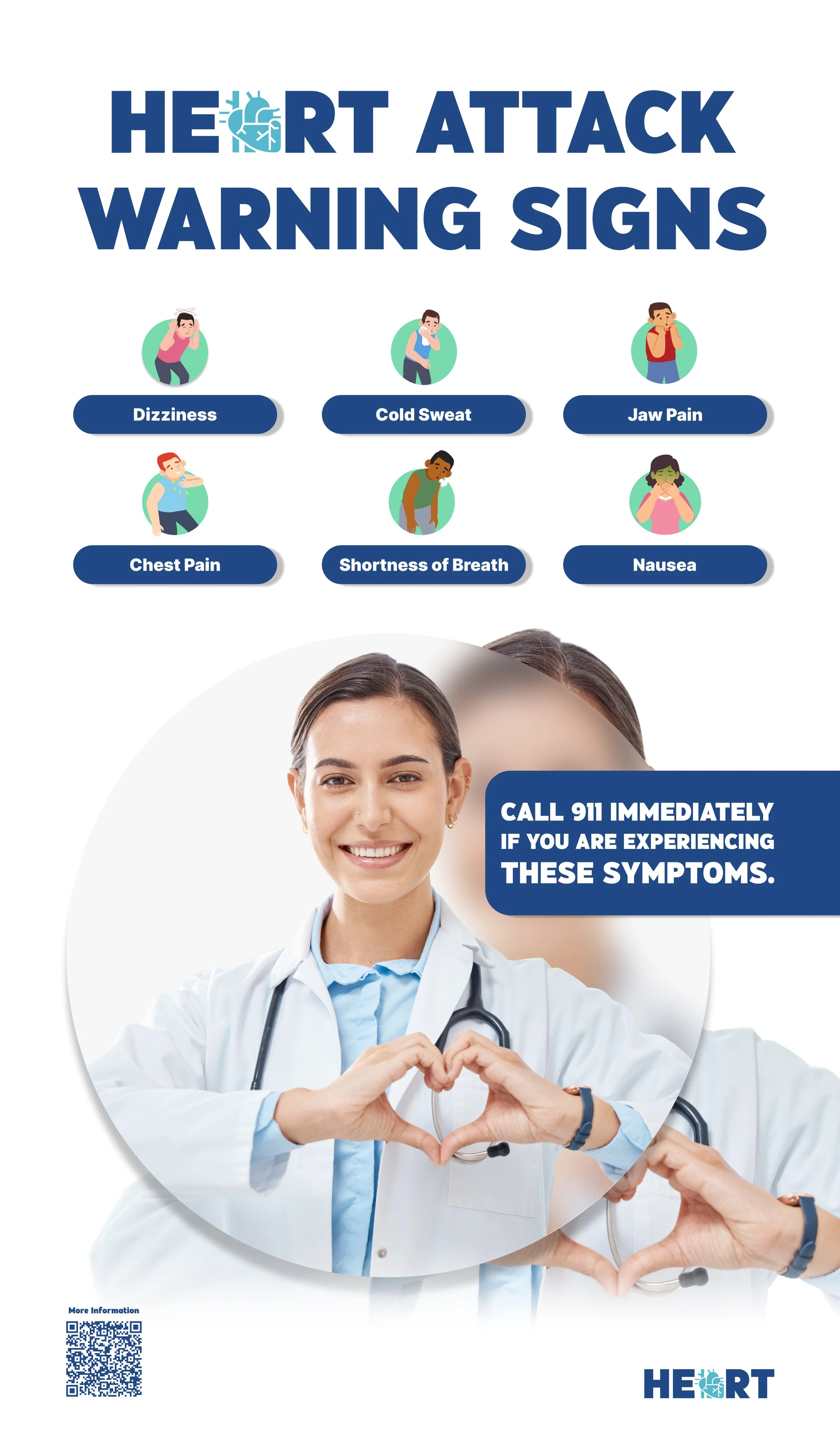
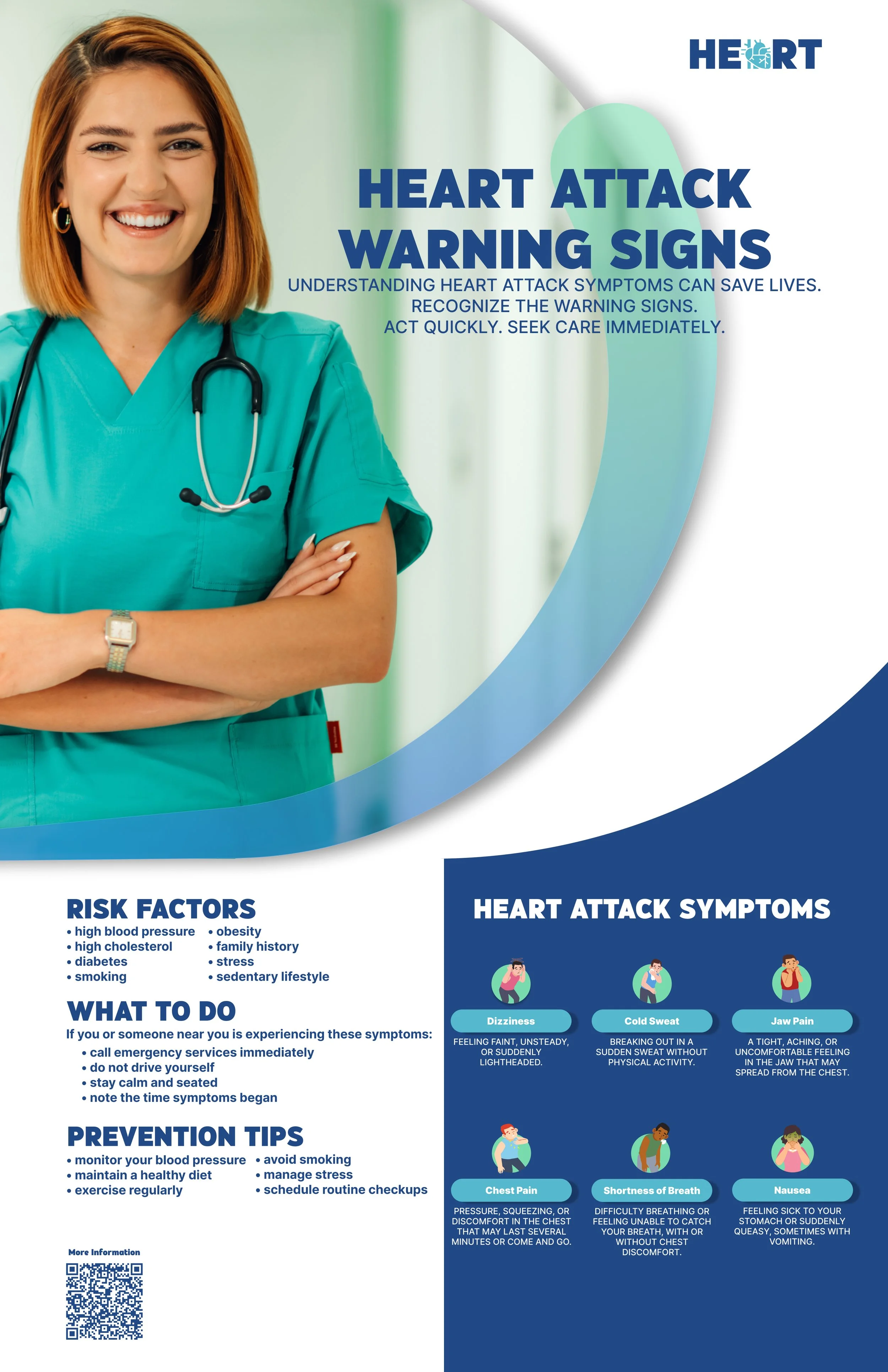
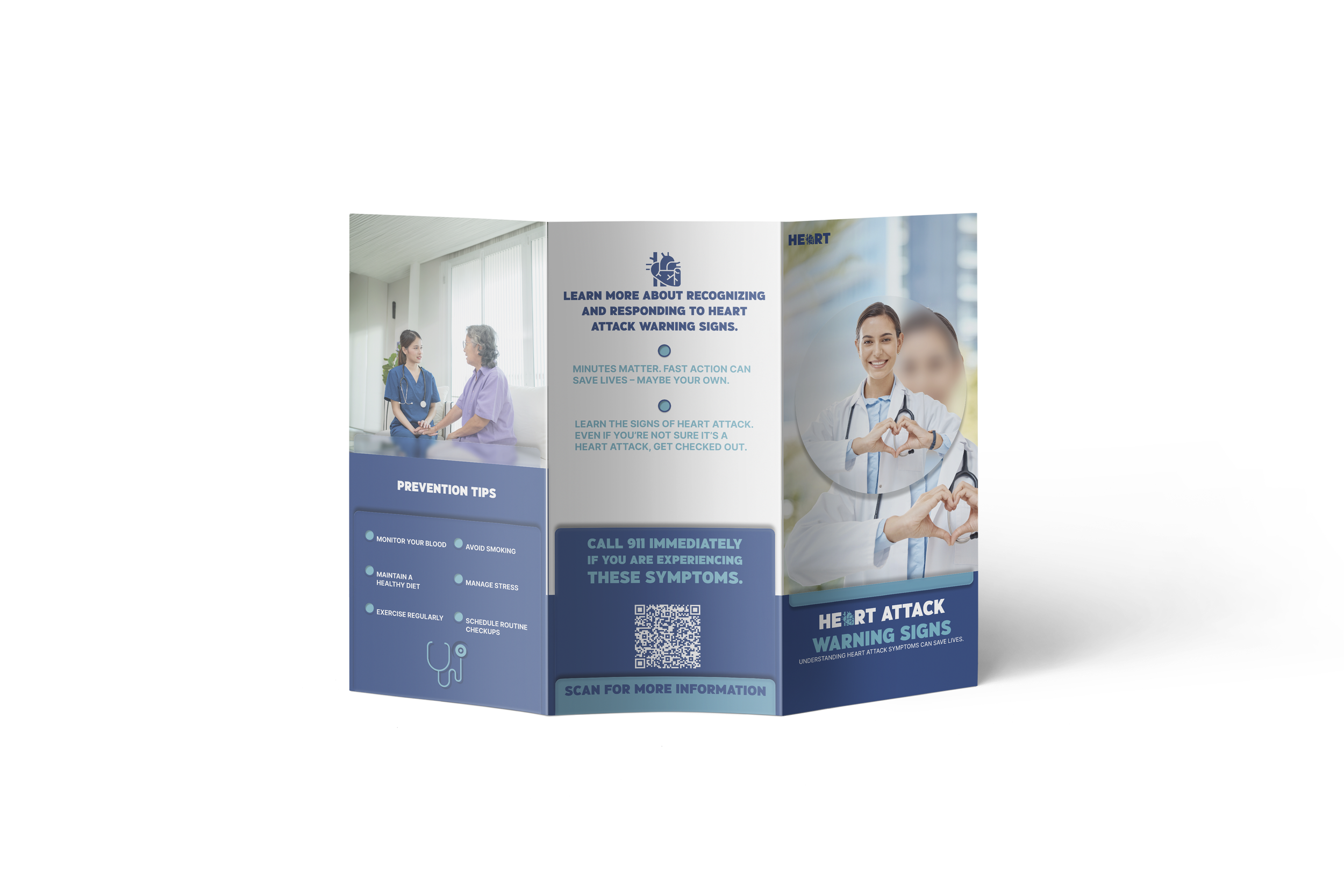
The visual system for the Heart Attack Symptoms campaign is built to communicate medical information with clarity, trust, and urgency. It uses a clinical color palette of blue, green, gray, and red to guide attention and reinforce meaning. Blue supports trust and calm, green supports accessibility and health, gray provides neutral structure, and red highlights emergency indicators and critical symptoms. Typography follows a clean and readable hierarchy using HindGothic and Inter to ensure accessibility and consistency across all materials. Symptom icons for chest pain, shortness of breath, sweating, radiating pain, dizziness, and nausea provide immediate recognition and support quick scanning in both print and digital formats. The system scales across posters, waiting room signs, brochures, flyers, social graphics, and motion content, all using a unified grid, spacing logic, and alignment rules. This creates a cohesive campaign that presents heart attack symptoms in a way that is easy to understand, medically trustworthy, and suitable for public health environments.
POSTER
Flyer
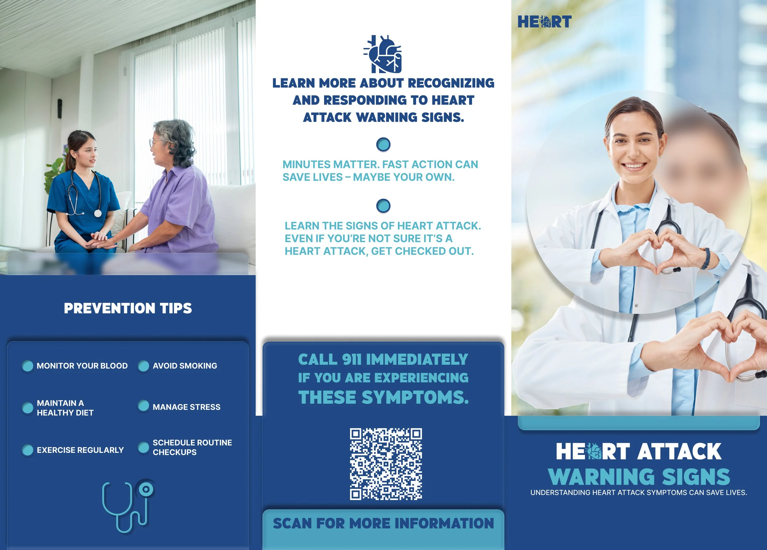
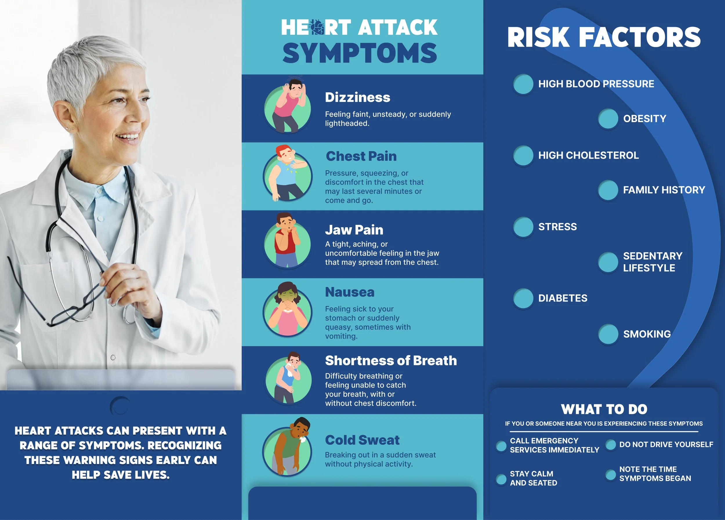
TRI-fold brochure
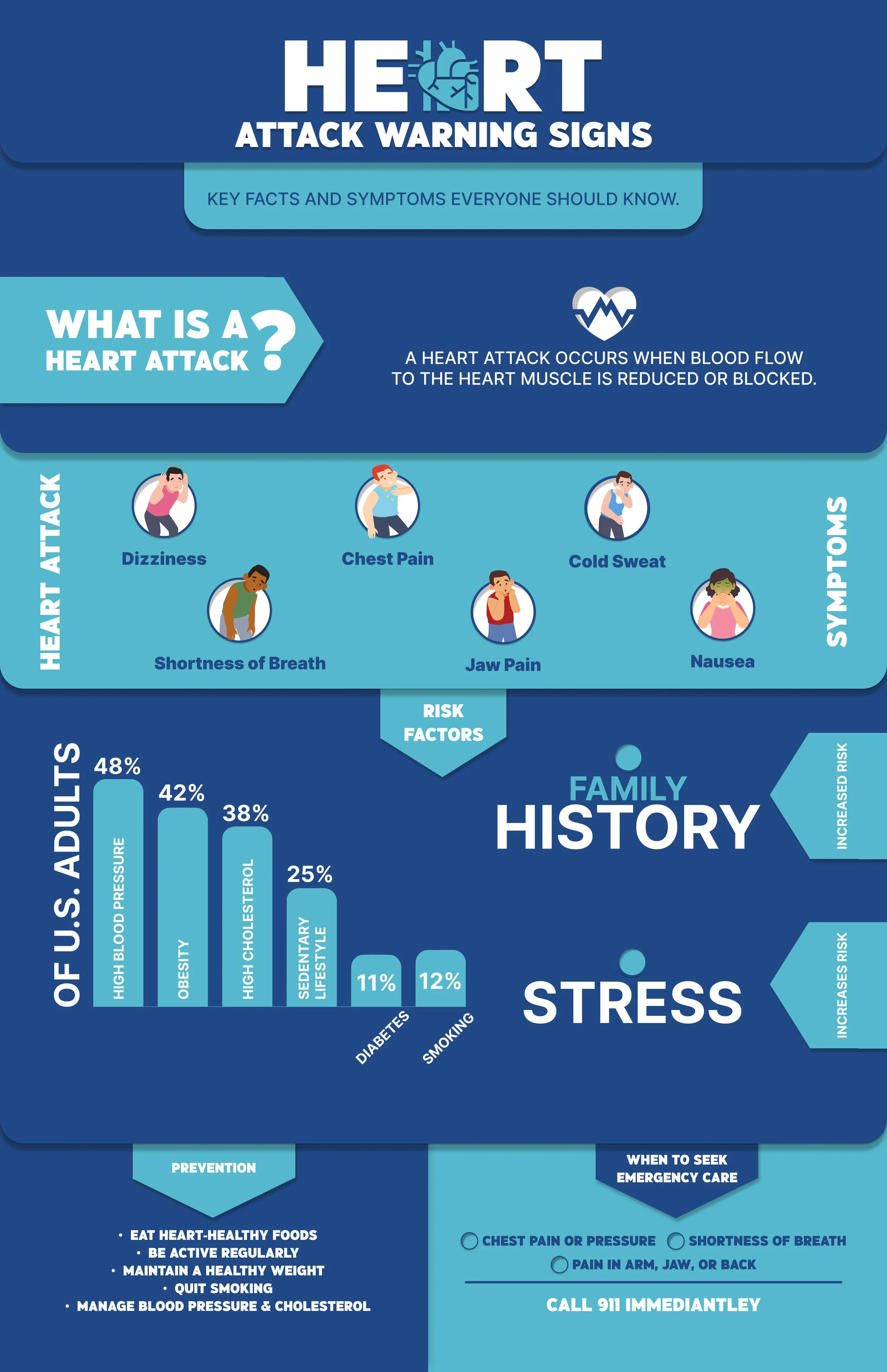
INFOGRAPHIC
Waiting room screens
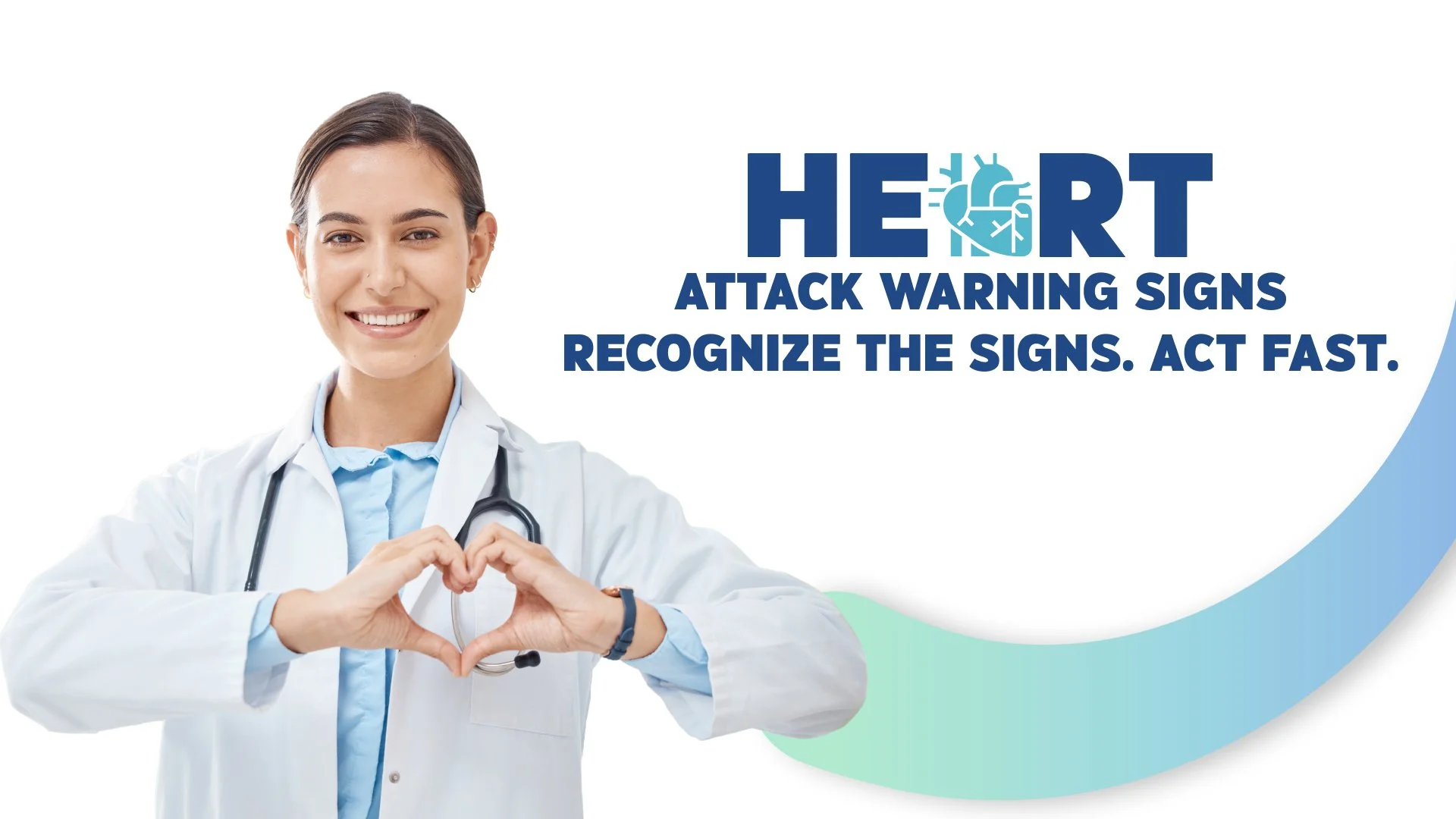
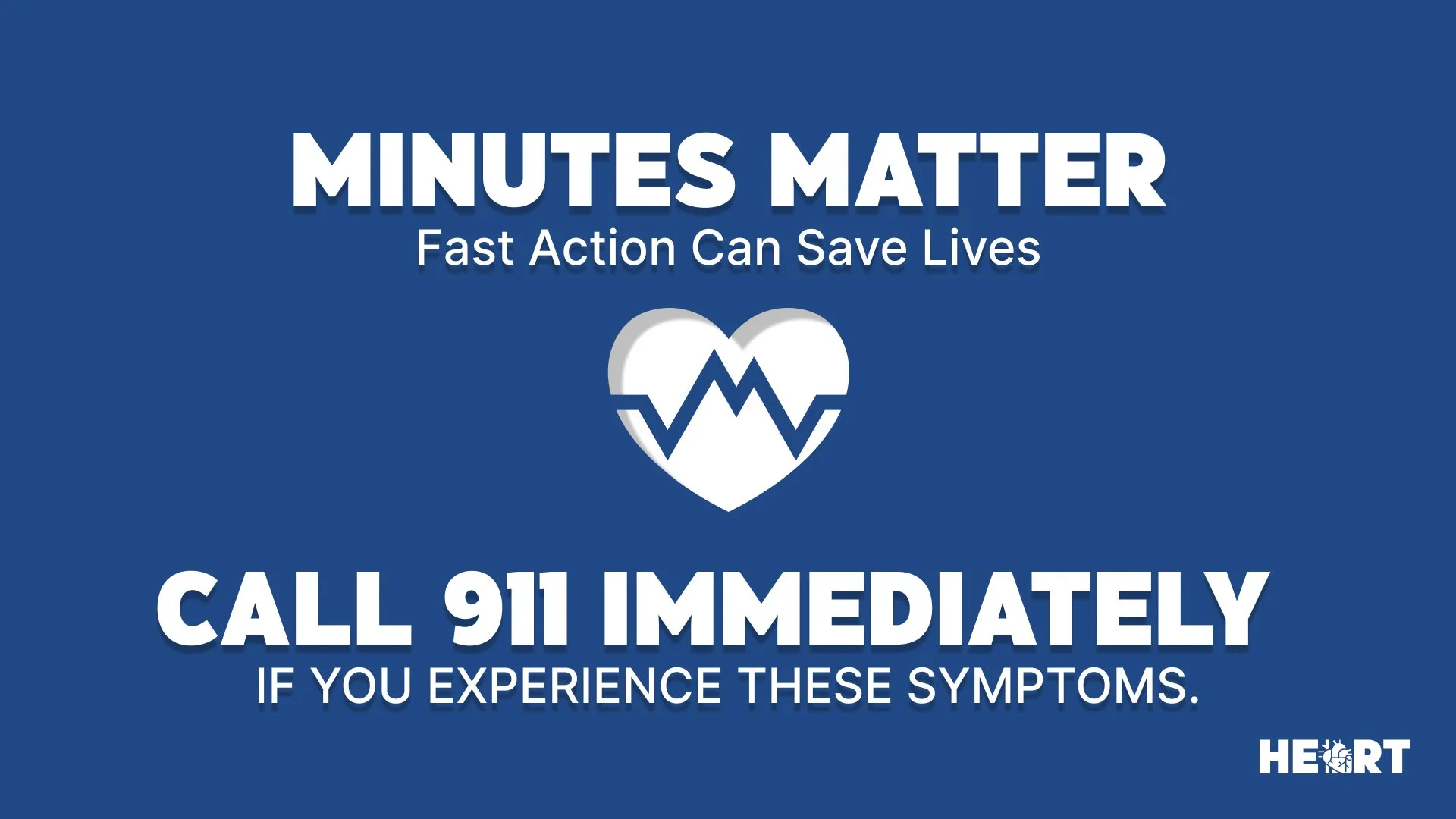
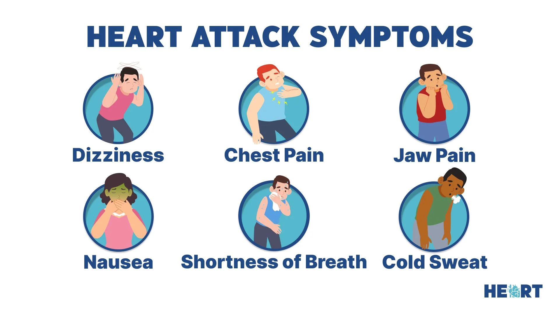
The Heart Attack Symptoms campaign improves public understanding of early warning signs by presenting medical information in a clear and accessible format. The unified visual system helps people recognize symptoms quickly, even in busy public health environments where attention is limited. Posters, waiting room signs, brochures, and social graphics work together to reduce confusion and encourage immediate action when symptoms appear. The motion graphic introduction strengthens engagement by guiding viewers through the information in a simple and memorable way. By combining clinical accuracy with strong visual communication, the campaign supports faster recognition, better decision making, and greater confidence for individuals who may be experiencing symptoms. It provides a reliable resource that can help save lives by encouraging people to act without hesitation.
Creating the Heart Attack Symptoms campaign reinforced the importance of clear and accessible communication in public health. The research showed that many people do not recognize early warning signs, and this guided every decision in the visual system and final assets. The process highlighted how clinical accuracy, strong visual hierarchy, and simple symptom iconography can work together to support faster understanding and better decision making. Building a unified set of materials across print, digital, and motion formats demonstrated how consistency strengthens trust and improves the way information is received. This campaign reflects a commitment to presenting medical information in a way that is easy to understand and ready for real world use, and it serves as a foundation for future health communication projects that aim to educate and empower the public.